This Mid-Century-Modern (MCM) sideboard, though plain, deserved better than the trash. I could already imagine replacing the existing base with new legs, placing fabric or wallpaper as a backdrop, and using a dark base colour, such a blue.
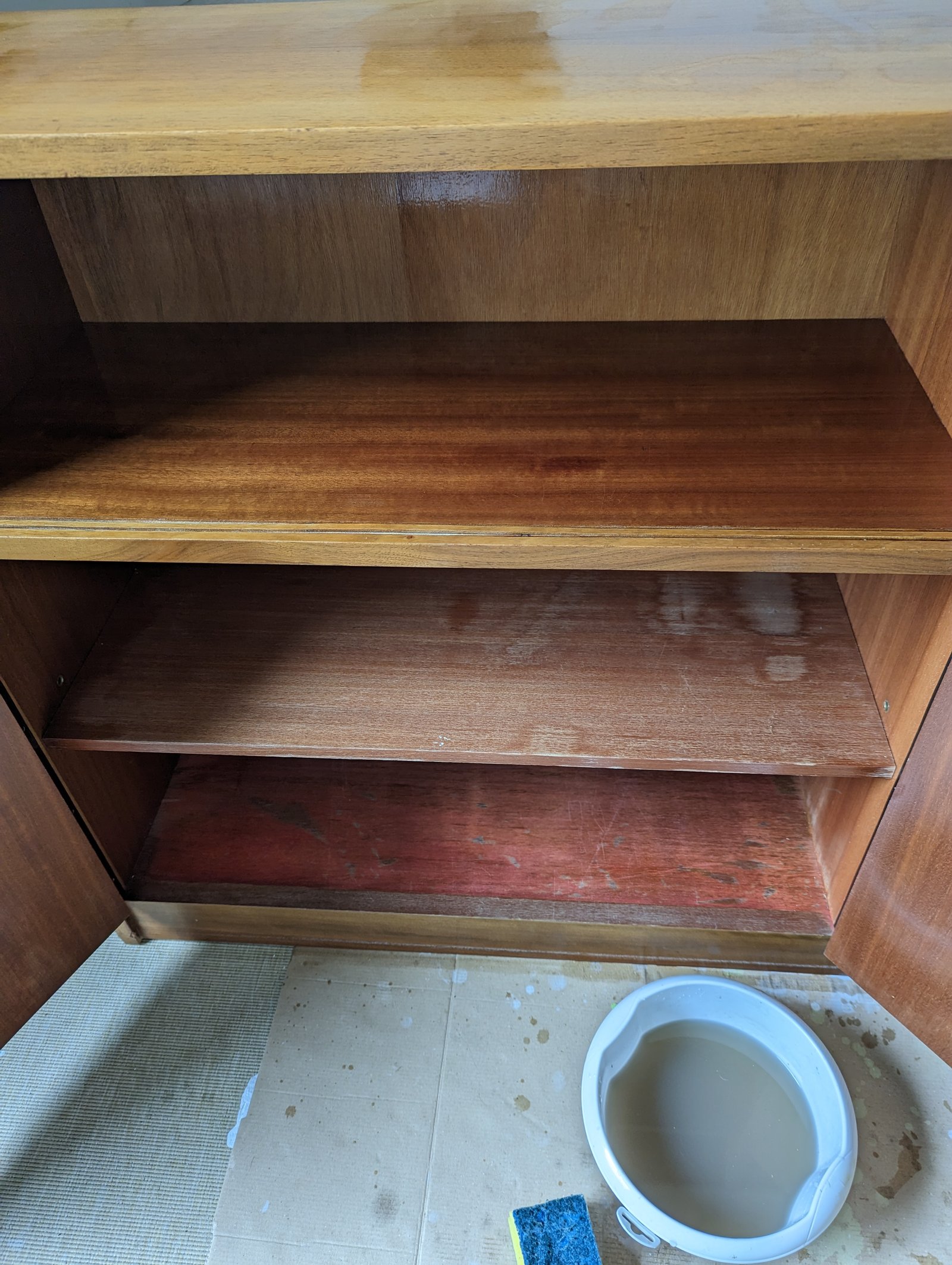
Before getting to the fun stuff, however, a good clean precedes stripping the piece down. This is such an essential part of the process, and it helps me become acquainted with the piece. The piece revealed all those injuries received, quirks developed, areas for growth, and obvious limitations. I didn’t check the sideboard before I picked it up and discovered damage to the wood veneer afterwards. Spilt liquid was the likely culprit, causing the veneer to warp and discolour. The warping was simple to fix, but the discolouration remained. I resolved that issue by painting the inside.


I also removed the back to improve accessibility to the body of the sideboard and coverage with self-adhesive wallpaper. From the beginning, I wanted to preserve the wood veneer on the top and front. Veneer this thin, however, is a challenge to work with. Stripping off the old finish is a delicate job, therefore, tearing through the veneer to the substrate is all too easy to do. To avoid this problem, I use hand tools at the beginning, such as a carbide scraper, and only use the sander to smooth over the finish. Unfortunately, the first stain I chose was too yellow with red under-tones for my taste and I had to strip back the stain a second time.
You can make it easier to choose the wood-stain colour when you work on a new piece by testing colours on a scrap piece left-over from the build. That is usually not an option for an old piece. Instead, I use a mix of guesswork and experience to re-imagine the colour. For the sideboard, I used two attempts before I got my preferred colour.
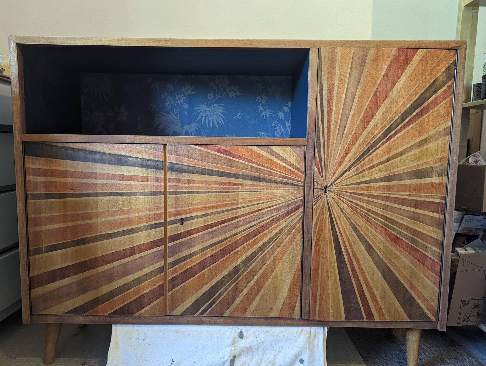
After the second staining attempt, I stepped back to get a feeling for what was happening with the piece. Again, I felt the front was too bland, and so I searched for inspiration. I’m drawn to marquetry, but this piece was too large for my first attempt. Something smaller and less risky, yes, but this, no. The concept of using different wood tones remained appealing, so I worked on a new design. I created a sunburst concept and spent 2 days carefully painting different wood stains on the doors. Several issues arose, but the deciding factor in why I scrapped this was my inability to get straight clean lines. Although I used good quality tape, the stains crept through.

Forced back to the design drawing board, I removed as much of the sunburst stain that I could. As I removed the stain, I realised I couldn’t stain the doors again. And did I mention the bland factor? In all fairness, a major element of the bland factor was the lack of interesting grain and wood structure in the original veneer. I resolved this challenge by painting the doors a blend of Midnight Blue and Coal Black by Fusion Mineral Paint. This provided a deeper tone, and I left the frame natural. Since playing around with Zentangle, my drawing confidence has grown, encouraging me to hand draw two fern fronds onto the front. The main one I painted with 3 different gold metallic acrylic paints. A teal metallic acrylic paint completed the second frond. The entire painting process took another 2 days as I worked to create clean lines with good coverage. In the future, I would not paint the background first, rather paint the leaves and background simultaneously. Making mistakes is all part of the process of learning.
There is that moment when everything finally comes together. This happened after I sealed everything with a hard wax oil by Oli Natura. Using hard wax oil on paint is not a recommended use, but I was curious to see if it would work. The challenge was getting it to soak into the surface, and there was more than one anxious moment while buffing the surface, thinking I had made a terrible mistake. However, I am pleased with the result. The surface is buttery smooth, durable, waterproof and the colours just pop. Taking those first photographic images and noting the light bounce off the gold and teal paint, pulled it together for me. Was it worth the effort? For me, yes. What do you think?
This is currently available for sale. Contact me directly if you are interested.


